Stamp
Brief: The aim of this project is to create a commemorative postal stamp based on the country you come from, were born in or currently reside in; a national achievement, a tradition, a holiday or event. The outcome must be a postage stamp size (40mm x 32mm) design and an A3 version of this.
Critical aims for assessment: critically and coherently develop my own work through problem solving (Process) , work both independently and collaboratively (Realisation) , complete critically engaged research which support my practice (Enquiry) , apply knowledge of cultural and commercial context (Knowledge) , and critically represent and articulate my practice throughout (Communication).
My personal aims to meet this criteria is to; experiment with a range of printing methods exploring new media to expand my illustrative discipline (Process), complete personal and peer feedback throughout my creative process in order to develop my own work (Realisation), complete a wide range of research looking at; context for my chosen subject to strengthen my chosen concept, stamp artists and stamp requirements in order to apply commercial context to my work, and artists who use similar media to which I plan to use in order to apply the best techniques to my practical work. (Enquiry and knowledge). Finally, I plan to document my processes and decisions throughout my creative process both on my blog and as annotations in my sketchbook, using personal analysis to critically develop my practical outcomes (Communication).
Primer Task
The primer task for this project was to collect images based on the tradition I wanted to document and research stamp layouts of this country. As I was born in England I wanted to explore the negative aspects of English Patriotism, which seems to primarily be associated with racist and fascist extremist groups such as the EDL and explore the negatives of having a royal family. I found it extremely difficult to research this topic, finding anti-monarchist art and information was difficult due to internet censorship. I felt this would be increasingly difficult in terms of imagery and translating this into an illustrative concept the size of a postage stamp, therefore I decided to abandon the idea, yet it is a subject I would like to return to in future projects.

Instead I decided to look into my Celtic ancestry, my family being both Welsh and Scottish, my ancestors would have practised the Pagan religion. Due to the time of year I thought this would be an interesting subject matter to explore further. I collected a range of information and imagery exploring different pagan festivals and traditions, documented in two blog posts. I was particularly interested in the Pagan holiday, Samhain. The Celts thought on the 31st of October each year, the dead was able to walk amongst the living for one night, the Celts used the festival to both honour and protect themselves from the spirits which were thought to rise. The festival also commemorated the Summer's end and the beginning of the harvest period. Although today it is most commonly celebrated as Halloween, the roots of these modern traditions originate from traditional Celtic rituals.
Traditions include:
Neep Lanterns; The Celts would hollow out turnips, carve faces on them and light candles inside. These were thought to ward off evil spirits, and lit around the large bonfires which were also lit to keep spirits at bay. When the tradition was brought to America, the tradition transformed into pumpkin carving as this was a Native fruit in America.

Guising; Known today as 'Trick or Treating', Guising was a traditional Samhain custom, where Celtic children would disguise themselves as evil spirits in order to blend in with the walking dead and protect them from harm. They would be offered 'treats' as offerings to further protect them from the spirits.

Apple Dookin'; The celts believed that apples were sacred fruits, catching an apple without using your hands was thought to bring good luck for the coming winter.
Although the traditions of Samhain are now considered to mainly be an American Custom in the form of Halloween, Pagan customs are still celebrated across the globe. Each year Edinburgh still celebrates traditions of Samhain at their Annual Fire Festival, https://beltane.org/samhuinn-fire-festival-2019/.


Preliminary Drawings
I struggled translating my initial research into preliminary drawings. I wanted to create a body of work including clear and simple designs that would work well when resized to a smaller scale. To give me further ideas I researched children's book artists to look at different ways Halloween could be communicated in a simple format. I began to create my initial ideas in a simplistic format, focusing on key imagery and shapes I wanted to use, based on my initial visual and contextual research.


Although I am happy with some of these initial sketches, an important part of the development process would be to incorporate patterns within the designs which would be effective when it came to creating prints.
Further Research
To develop my preliminary drawings I felt it would be useful during this process to research Celtic Symbols and writing. I knew I wanted to have writing on my final design as I didn't want the theme to be confused with the Americanised Halloween, I thought it would be integral to my final design to research writing fonts, as this would be a primary element to my final design. In order to do this I researched Celtic Calligraphy and used this research as a tool to develop my own text.


Development
During the development process I decided the media I would like to use was print. I felt my most effective designs were the fire and ghost design, and the neep lanterns, so therefore created more developed versions of these using pattern and tone. I further developed these designs begining to think about colour. I wanted to use warmer autumnal colours which have connotations of the season of Samhain, oranges, yellows and reds. I photocopied my favourite designs in these colours, to explore which colours were most effective.


I think these designs are effective in the shapes and bold colours, as I think this will still be able to represent my theme clearly at a smaller scale. I feel in previous projects I have relied heavily on use of physical drawing and haven't experimented much with alternate media, therefore I began to transfer these designs into lino print.


Critical aims for assessment: critically and coherently develop my own work through problem solving (Process) , work both independently and collaboratively (Realisation) , complete critically engaged research which support my practice (Enquiry) , apply knowledge of cultural and commercial context (Knowledge) , and critically represent and articulate my practice throughout (Communication).
My personal aims to meet this criteria is to; experiment with a range of printing methods exploring new media to expand my illustrative discipline (Process), complete personal and peer feedback throughout my creative process in order to develop my own work (Realisation), complete a wide range of research looking at; context for my chosen subject to strengthen my chosen concept, stamp artists and stamp requirements in order to apply commercial context to my work, and artists who use similar media to which I plan to use in order to apply the best techniques to my practical work. (Enquiry and knowledge). Finally, I plan to document my processes and decisions throughout my creative process both on my blog and as annotations in my sketchbook, using personal analysis to critically develop my practical outcomes (Communication).
Primer Task
The primer task for this project was to collect images based on the tradition I wanted to document and research stamp layouts of this country. As I was born in England I wanted to explore the negative aspects of English Patriotism, which seems to primarily be associated with racist and fascist extremist groups such as the EDL and explore the negatives of having a royal family. I found it extremely difficult to research this topic, finding anti-monarchist art and information was difficult due to internet censorship. I felt this would be increasingly difficult in terms of imagery and translating this into an illustrative concept the size of a postage stamp, therefore I decided to abandon the idea, yet it is a subject I would like to return to in future projects.
Instead I decided to look into my Celtic ancestry, my family being both Welsh and Scottish, my ancestors would have practised the Pagan religion. Due to the time of year I thought this would be an interesting subject matter to explore further. I collected a range of information and imagery exploring different pagan festivals and traditions, documented in two blog posts. I was particularly interested in the Pagan holiday, Samhain. The Celts thought on the 31st of October each year, the dead was able to walk amongst the living for one night, the Celts used the festival to both honour and protect themselves from the spirits which were thought to rise. The festival also commemorated the Summer's end and the beginning of the harvest period. Although today it is most commonly celebrated as Halloween, the roots of these modern traditions originate from traditional Celtic rituals.
Traditions include:
Neep Lanterns; The Celts would hollow out turnips, carve faces on them and light candles inside. These were thought to ward off evil spirits, and lit around the large bonfires which were also lit to keep spirits at bay. When the tradition was brought to America, the tradition transformed into pumpkin carving as this was a Native fruit in America.
Guising; Known today as 'Trick or Treating', Guising was a traditional Samhain custom, where Celtic children would disguise themselves as evil spirits in order to blend in with the walking dead and protect them from harm. They would be offered 'treats' as offerings to further protect them from the spirits.
Apple Dookin'; The celts believed that apples were sacred fruits, catching an apple without using your hands was thought to bring good luck for the coming winter.
Although the traditions of Samhain are now considered to mainly be an American Custom in the form of Halloween, Pagan customs are still celebrated across the globe. Each year Edinburgh still celebrates traditions of Samhain at their Annual Fire Festival, https://beltane.org/samhuinn-fire-festival-2019/.
Preliminary Drawings
I struggled translating my initial research into preliminary drawings. I wanted to create a body of work including clear and simple designs that would work well when resized to a smaller scale. To give me further ideas I researched children's book artists to look at different ways Halloween could be communicated in a simple format. I began to create my initial ideas in a simplistic format, focusing on key imagery and shapes I wanted to use, based on my initial visual and contextual research.


Although I am happy with some of these initial sketches, an important part of the development process would be to incorporate patterns within the designs which would be effective when it came to creating prints.
Further Research
To develop my preliminary drawings I felt it would be useful during this process to research Celtic Symbols and writing. I knew I wanted to have writing on my final design as I didn't want the theme to be confused with the Americanised Halloween, I thought it would be integral to my final design to research writing fonts, as this would be a primary element to my final design. In order to do this I researched Celtic Calligraphy and used this research as a tool to develop my own text.
Development
During the development process I decided the media I would like to use was print. I felt my most effective designs were the fire and ghost design, and the neep lanterns, so therefore created more developed versions of these using pattern and tone. I further developed these designs begining to think about colour. I wanted to use warmer autumnal colours which have connotations of the season of Samhain, oranges, yellows and reds. I photocopied my favourite designs in these colours, to explore which colours were most effective.


I think these designs are effective in the shapes and bold colours, as I think this will still be able to represent my theme clearly at a smaller scale. I feel in previous projects I have relied heavily on use of physical drawing and haven't experimented much with alternate media, therefore I began to transfer these designs into lino print.


I feel as though these initial prints are effective in illustrating my basic design ideas, the photocopied prints exploring colour were useful in exploring colour, I felt the yellow print wasn't effective as it seems to bright with more positive connotations, whereas I want the final piece to have darker and more sinister connotations so will therefore be using darker tones of red and orange. Furthermore, this was my first attempt at using lino-print and these pieces have an unprofessional and messy quality, I haven't thought thoroughly about how I could use the empty space in the print and have simply copied a line drawing onto the print, I will develop this further in future designs.

Wanting to explore which other imagery was effective I completed the above print. I think this is one of my least effective prints because I used a harder lino instead of the soft-cut lino. This had a negative impact on the outcome as the lines are very jagged and not as smooth as when using soft-cut lino, I also found this texture of lino was harder to produce a clear ink transfer.
Further Development
During the initial development process using lino-cut prints I concluded that the soft-cut lino-prints were most effective as they allowed me the most control over my design, and the printed effect was clearer and more cohesive. In the further development process I aimed to consider how empty space could be useful in creating my prints, as oppose to replying only on line work. I also began to incorporate my colour experiments into the prints by experimenting with layered relief prints. I began to work further into my designs, experimenting with the use of pattern work.


The pattern work in the top image was ineffective as I felt it distracted from the main design, however I felt the black and orange worked well against one another, this could have been done more effectively by creating a thicker layer or printing ink.
In the second design I experimented with relief printing, printing the orange fine before creating the rest of the design. This experiment was unsuccessful as the orange is still visible below the black ink, and the two layers don't match against one another. This could be further improved by creating thicker layers of paint to make a clearer print. In further designs I won't be using intricate pattern as I feel this distracts from the design and will be unclear when resized to the postage stamp scale.
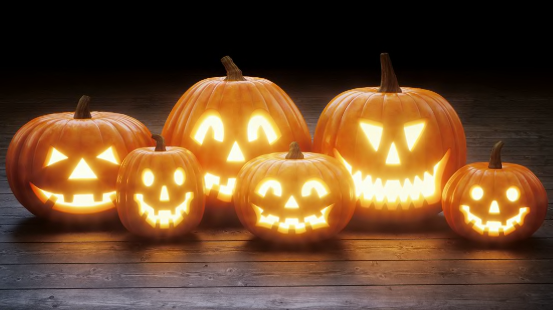
In creating the pumpkin design I wanted to create an accurate image of how a craved pumpkin looks, and how the shapes of the features work with the grooves of the pumpkin. I carved my own pumpkins to explore this further;


I feel these prints are my most effective designs, the use of blank space in creating the print makes the colouring of the piece clearer, and the overall piece more effective. I feel more could have been done with colour to be further representative of the fires lit for Samhain, to do this I will complete further colour scheme research of fires, and use Photoshop to edit the colours of this design. I did not have enough time or resource to develop these prints into further print medias, and would have liked to have had time to experiment with screen printing, I shall return to this in future projects.
Final Treatment
Using what I felt was my most clean and effective print, I scanned the design in and edited the colours on Photoshop, referring to UK postage stamp requirements I also added the stamp category and the queens head.


Crit and Feedback
Although I was happy with the clarity and design of my final piece for this project, I felt as if I could have pushed the final design further to incorporate further elements from my research and creative process. I would have liked to further incorporate Celtic and Pagan imagery, and would have liked to experiment with more intricate prints, and even develop my lino prints into relief and screen prints. Initially I thought that keeping the design as simple as possible would be the most effective route to take as the stamp would need to be translated into a smaller size. After seeing other's designs at the group crit, I felt I could have picked myself further in terms of visual imagery and detail, as there were ways to make detail effective at small scale.
Using a range of feedback I began to consider how my design could be further developed. I received feedback from my peers on the illustration course, in order to give me some professional constructive criticism which I could utilise to develop my illustrative processes:
I think these designs are bold and effective, they will need to incorporate the elements of professional stamp making in order to fit the brief, as you have chosen to look at the UK in this project you will need to conduct research on UK postage stamp requirements. I think the designs would translate really effectively into screen prints. I have never heard of the festival of Samhain and although it is written on the design would initially think your chosen theme is Halloween, you could include further Celtic Imagery, which although apparent in your research hasn't been transferred into your practical work, this could include the Celtic symbols, and more emphasised and thoughtful use of font.
As the audience for the final product will be the general public whom would use the stamp itself, I also felt it necessary to collect feedback from friends who do not have a background in art and design, as this would inform me how the final piece would be interpreted if it was actually released.
I think the print looks professional and well made, the imagery is kind of spooky, I wouldn't know what Samhain is by looking at it until I looked at your research, some of the celtic symbols are really nice and I think it would look nice if you incorporated these. I prefer the fire design but think it doesn't look as professional, if the two were combined it could look good.
I also collected tutor and peer feedback during the group crit on 05/11/2019. Common points were made:
- Doesn't initially give the impression that it is a Celtic festival, more elements of Pagan and Celtic imagery could have been used, Celtic design work could have even been used in a minimal way, for example the branches of the pumpkins or the writing of 'Samhain'.
- The colour use is bold and effective, it would have made the image more visually interesting if you had experimented with gradients, which would also reflect on both the concept of fire, and support your visual research of this.
A lot of similar comments were made while collecting feedback for my final design, although the project itself has ended I will complete further consideration to how my design can be improved before the final hand-in in January, although I may not have time to complete a further final piece, I shall be completing designs for how this could look improving on the key points that were made:
- Further consideration of Celtic shapes, imagery and text, experimentation of how this could be incorporated into the final design whilst keeping the effective bold quality of the print.
- Further consideration of concept and research, looking at the fires related to Samhain and how I could convey this with use of colour, exploring gradient on both print and Photoshop.
- The incorporation of further detail with consideration of translation to smaller scale, looking at how more detail can be added but keeping this restrained in order to correlate with the final treatment of a to-scale stamp.


Comments
Post a Comment